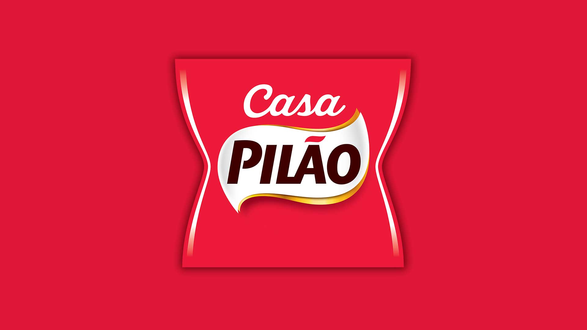
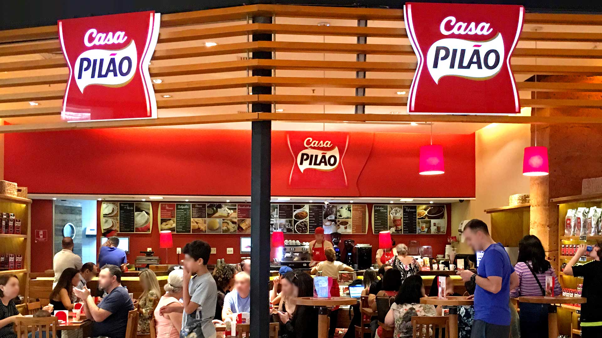
Casa Pilão wanted to have its brand redesigned aiming to make both its positioning and language really clear so as to bring it close to Pilão, its parent brand.
We realized that consumers did not associate Pilão with Casa Pilão. To reinforce this relationship, we chose to harmonize the logo in an icon that alluded to the individual packaging of the coffee and the application of the brand, creating a unity in the retail and in its stores.
A red protection, which isolates it from the background, was adopted. This allowed the application of the brand, in different formats of store and surfaces, to be uniform, giving the same personality to the environment and its utensils.
This work valued the strength of the Pilão brand by creating an icon of easy identification, and one that integrates the brand with all its points of contact.